|
|
Post by Professor Moriarty on Apr 10, 2017 14:02:00 GMT -5
I will have to get back to you on that one, Dave.
|
|
|
|
Post by Professor Moriarty on Apr 18, 2017 17:27:26 GMT -5
|
|
|
|
Post by davet on Apr 18, 2017 18:13:21 GMT -5
Very cool. It looks so real next to that pinewood derby scale garage with real locking garage door, shrubs and hand laid brick driveway.
Whats the benefit to having the rear area of the trailing fenders open?
|
|
|
|
Post by Professor Moriarty on Apr 18, 2017 18:27:19 GMT -5
I am just using this for inspiration... trying to decipher the "rules" that the graphic designers follow when laying these things out.
|
|
|
|
Post by Skywalker Racing on Apr 18, 2017 18:53:37 GMT -5
Not much graphic design to it. They use the company logos/fonts. Bigger sponsorship dollars gets you bigger size/premium placement on the car. At least I think that's the theory. It's how I'd do it.  |
|
|
|
Post by Professor Moriarty on Apr 18, 2017 19:07:48 GMT -5
Not much graphic design to it. They use the company logos/fonts. Bigger sponsorship dollars gets you bigger size/premium placement on the car. At least I think that's the theory. It's how I'd do it.   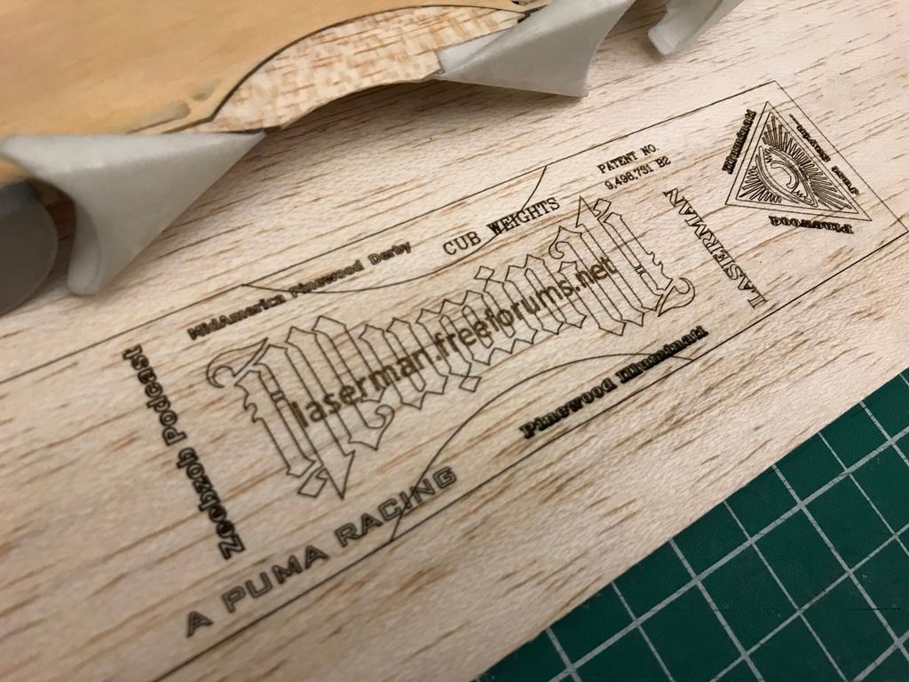 |
|
|
|
Post by Skywalker Racing on Apr 18, 2017 19:30:22 GMT -5
That looks awesome!! Facing the wrong way though.  At least for NPWDRL. How thin is that balsa cover? Will be tough to get it to sit down right on that car without cracking? EDIT: Note to self: I need a laser cutter. EDIT #2: Use less colons. : : : |
|
|
|
Post by Professor Moriarty on Apr 18, 2017 19:35:38 GMT -5
Hi Scott,
Why is it the wrong way? For the winner's photos?
I am going to etch this directly on the car if I ever like it...
It is a little risky as there are no take backs... I want to make some words more legible...
Weigh in... what should I add, subtract, do differently... been screwing with it for hours already and still unhappy.
|
|
|
|
Post by Professor Moriarty on Apr 18, 2017 19:45:34 GMT -5
I think that I like the way the laserman.freeforums.net is directly over the Illuminati logo...
Maybe I will try more of that.
|
|
|
|
Post by Skywalker Racing on Apr 18, 2017 19:45:38 GMT -5
Hi Scott, Why is it the wrong way? For the winner's photos? I am going to etch this directly on the car if I ever like it... It is a little risky as there are no take backs... I want to make some words more legible... Weigh in... what should I add, subtract, do differently... been screwing with it for hours already and still unhappy. Right. Wrong way for winner's photos. One should always assume he will be in said photos. You can see here that my car is correct. Cram and LRW are not.  I love the dollar font you've got working with your logo. I'd take the URL out of the middle and replace "Pinewood Illuminati" with with the URL using that dollar font LASERMAN as that part of the URL. Maybe put the patent number centered once LASERMAN is made part of the URL. Can you etch on the side of the car? Probably no where to do so the way its sanded, huh? Now that you've said it will go directly on the car, my question about it being a cover is moot. I assume that is also why the rear is blank - because that's where the tungsten is exposed? |
|
|
|
Post by Skywalker Racing on Apr 18, 2017 19:48:43 GMT -5
Hard to know without playing around with it.
If you're going for the race car sponsors look, I'd drop the MA logo and Zeeb's actual logo on the car. If you need it in vector, I think I have it. Was going to put it on a SR of mine...that actually should still happen eventually.
|
|
|
|
Post by Professor Moriarty on Apr 18, 2017 20:09:04 GMT -5
OK!!! Now you are talking!!! I see where you are going with this now... It was fairly unintentional up until this point.... but a dollar should be the aesthetic to latch onto.
Good stuff!
|
|
|
|
Post by Professor Moriarty on Apr 18, 2017 20:40:58 GMT -5
Hi Scott... no room on sides of car... I will use a cover of some sorts.. either clear packing tape... or maybe green now... I want the stuff to show thru so probably clear... I want to bring the cover up onto the fenders about .125" so I can get a radius where the fender meets the body... also... a cover always tuns out a little smoother.
|
|
|
|
Post by Crash Enburn on Apr 18, 2017 22:06:46 GMT -5
From the layout you have, I'd say to flip "Mid-America Pinewood Derby", "Cub Weights", and the patent number around 180° so it's legible from the other side. That car better be fast, Joe! |
|
|
|
Post by cramjet on Apr 19, 2017 5:08:35 GMT -5
As for Mid America, I will be racing proxy with four of my cars. In my box will be one scout car and his older brother's car (raced scout last year and crossed over). I expect strong performances from my BASX "Chemtrail" and my Unlimited "SMZ", but Natalee and Anya will still be tough as long as it's not on John's track. |
|


 At least for NPWDRL.
 "
"
